
Content Solutions DocumentationPublished Date: February 19, 2024 Downloaded: June 23, 2026, 5:36 pm |
 |
Content Solutions Documentation |
StoreSite Admin
February 19, 2024
Location: Control Panel > StoreSite Admin > select store to edit.
Contents
- Overview
- Settings
- Layout
- Appearance
- Messaging
- Components
- Pages (Tabs)
- End Contacts
- Store Support
- E-mail Notifications
- CPAS
- Punchout
- Reporting
Overview
ChannelOnline comes with a built in e-commerce store site, plus a preview store for testing settings prior to adding them to your default site. During account activation the original Admin user selected the starting layout, colors and font for the store. Some ChannelOnline accounts will have more than one store enabled for use (contact your sales representative for additional stores). Stores use a simple template and component design system that is easy to implement.
There are a variety of ways ChannelOnline stores are used as part of conducting business.
- Marketing and e-commerce combined.
- E-commerce portal (only) linked to from a company marketing website.
- Account document activity access and reports.
- For government or school contracts.
- Electronic signature formatting.
- For connecting via punchout services.
- As a posted catalog of products and services.
Preview Store
Every instance of ChannelOnline comes with one Preview store for testing settings and components. This store is tied to a system generated backend user, “Preview User” for login and testing, it is only available for use through Admin. Note: Do not delete this Preview User from your account contact list, doing so will remove access to the Preview store.
- Copy function (details below). Use the copy function to move components and settings to your live store after testing them in the preview store.
Main Sections
StoreSite Admin is divided into six different sub-tabbed sections: Settings, Layout, Appearance, Messaging, Components and Pages. Within each sub-tab there are multiple sections specific to that area of the store. Use the Expand All button to see an overview of all your store settings for each section. Select the edit button for any section to make changes. Although most pages autosave, be sure to click the “Save” before you move to different sections to ensure that your changes get captured. Details of each sub-tab section is contained within this document after the overview table below.
| Settings: This section contains most of the basic settings for your StoreSite, including your setup information, print defaults, product display, and cart options. |
 |
| Layout: Choose your overall site theme from three starter themes, determine responsiveness, select columns by page type (one, two or three), set search location, and organize components. |
 |
| Appearance: Pick your style, color scheme, font type and upload sample content. |
 |
| Messaging: Set up messaging text to be displayed for marketing, support, login, legal and basic logo branding. |
 |
| Components: These are content modules (components) that can be enabled for the StoreSite. Available components include: company information, catalogs and pricing, spotlights, featured products, banners, business or social icons, and custom messaging (for more, see Components section below). |
 |
| Pages: Add additional pages for navigation, supporting content, landing pages, contact us, registration and frequently asked questions. |
 |
| UPDATE WARNING: Updates may take up to two minutes to appear both in StoreSite Admin and on the store. Many features have default settings you can return to, but check prior to saving any changes. Remember that using the Preview Store for experimentation is greatly encouraged. |
SETTINGS
The settings section has may options used to set up the main experiences for how visitors interact with the store. Many settings are covered in this guide, please reach out to support if you have questions on any settings not covered here.
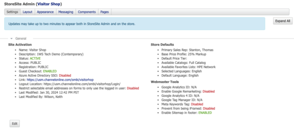
General: This section includes some key site activation settings that need to be addressed as to how visitors (end contacts) interact with the store. Once enabled, these settings are the basis of visitor interaction.
- Public VS Private. This controls visitor access to your store. A public store allows anyone to browse your store to see products/services and pricing. In Private mode, all users are forced to login before any item/pricing will be displayed.
- Self Registration. There are two aspects to self registration: 1) the ability for end contacts (visitors) to sign up and create their own account, 2) the ability to have all registered visitors be contacts under the same account. This latter option is typically used when as store has been dedicated to a specific existing account.
- Guest Checkout. When self registration is enabled, you can also add the guest checkout option. Chose to use either the original electronic signing document style or the newer checkout steps style. This newer style flows more like the regular checkout process. After a user has added items to the cart on a public store they can opt to checkout as a guest. Selecting Checkout button presents the user with these options on the login page: login, register, or checkout as guest. Guest Checkout visitors do not have official accounts, but all activity is tracked on the document activity tab like all other end contacts.
- “Enable Guest Checkout” – Similar to the regular checkout process (recommended) with three steps: Billing and Shipping, Payment and Delivery, and Review Order.
- “Use E-Sign for Guest Checkout” (original) – Electronic signature single page document display style.
- Guest Activity – For users not logged in to the store, they will see a link called “Order Tracking” when they visit the store to follow up on their orders. The “Order Lookup” link will show in the main top navigation after the Checkout link on Classic layout and before Checkout link on Contemporary layout. Users with a valid email and order confirmation number will be able to search for and view their order document.
- Storesite Name and Description. This includes the store name, it’s internal description and what text string is used in the URL to identify it.
- Shortcut (URL name) – Your shortcut will be the directory name after the ChannelOnline extended domain. For example, if you access ChannelOnline via: https://usm.channelonline.com/acme/storesite. Your store shortcut would be STORESITE. This store default name can be changed, but no name can be reused. Please check shortcut availability before saving.
- Name – The store’s name is the text name of the store used for display in some areas.
- Description – Internal description is used in Store Admin.
- Logout Location – Place to send visitors that log out. Usually the store itself or a separate company marketing site.
- Store Defaults. Think of these as shopping defaults for visitors that are unassigned an account, or not logged in (public).
- Catalog / Pricing / Favorites – Assigning a default catalog and price profile are required; favorites and price tiers are optional. These are important for public browsing or self registered visitors. Customers already in the system will still see their assigned catalog and price profile information.
- Set Favorites Lists – Can be apart of default settings for self registered users.
- Sales Rep – Ability to assign a sales representative to all new registered visitors and for unregistered visitors using the contact us form.
- Languages. The store has the option to set a default language and second supported language for its geographical market. When enabled on a store the user’s language switch is located in top navigation for a store.
- US supports English (default), and or Spanish.
- Canada supports English (default), and or French.
- Web Master Tools. Tools to assist marketing and search engine optimization.
- Google Analytics 4 (formerly known as “App + Web”) – GA4 has been additional to the store settings options. Enabling Google Analytics 4 measurement ID will automatically disable the older analytics ID plus its “Remarketing and Advertising Reporting” within the system. Google Tag Manager is independent and will still be used but the older Universal Analytics will be disabled. To switch, go to, Settings, Webmaster Tools, insert our Analytics 4 ID and hit save. Once saved you we begin receiving data in the newer Google Analytics account, no data will be delivered to the older Universal Analytics account.
- Google Conversion Tag Manager – new support for the conversion tag manager is simple to activate. Just add your Tag Manager ID to the store Settings and our pre-formatted script will allow Google to track all your store activity. From the Google portal you can run any variety of reports.
- Meta Keywords – support is included for custom tabs and pages you create with your store admin under Pages custom tabs and pages. Simply enter the string of keywords that you would like to associate with that page.
- Prevent iFrame – This stops the store from being called into and iframed environment. Commonly used for Punchout services and SSO setups.
- HTML/XML site map – This is optional for better search engine accuracy and user navigation. Enabled in the store settings web master section by going to StoreSite Admin, select store to edit, in Settings’ General section, scroll down to Web Master Tools area. There, select the checkbox for “Enable Sitemap in footer”.
- Email Restriction. Force the use of the logged in users contact email; blocks email field editing on checkout.
- Single Sign On. SSO with Azure Active Directory (additional service) allows for the implementation of MS Active Directory or Shibboleth method single sign-on for the visitors to access the hosted store from their own internal portal. (Requires SOW for approval please contact sales).
Product: There are many product settings that can be enabled on the store. Here we will cover those that may need some clarification.
- Service and Labor. These items (when activated) are available to be browsed on the store by selecting the Services sub-tab under Products.
- Discount off MSRP. Ability to display on product pages the percentage discount off MSRP that the end customer is paying. To active, check the box next to “Show Discount off of List Price on Product Overview”. This requires the “Show List Price on the Product Pages” to be enabled (checkbox option above).
- Product Reviews. A review can only be made by logged in visitors with a valid ID and password. Public store visitors not logged in, will be able to read reviews but not create them.
- Product Suggestions. When enabled at the item level, suggested items work like supported related products and will appear in their own sub-tab on the product view page. These suggested items can then be added a cart.
- Additional Products. Because additional products are uncategorized items without supported data, some resellers prefer to hide them from their visitors for better search usability.
- Logo Program (recommended). Supported Logo Program icons provide scroll-over details with product information to promote program brands (i.e. Microsoft Office and HP warranty information) item add on sales to the cart.
- Login for Price option. This store setting that can be used to only show ‘Login for Price’ in search results and product pages for public stores. Visitors must log then in or register to see actual item pricing. Setting activation is located in a store Settings sub-tab under the Products section. Click on the checkbox next to the label “Show only “Login for Price” on the public store access, logged in visitors will see prices”.
- In Stock / Availability. Setting to display either Avail QTY, In stock, or Out of Stock values to customers on search results pages. To enable, select the checkbox “Set what you want to display for item Qty on search results.” There are two options presented there. Either, “Show Qty”, or the second option is to select “Show In Stock” if stock is equal to or greater than [___] and “Out of Stock” for items below this value. The default setting is to show the actual quantity. This gives administrators that chance to hide qty if it does not meet a minimum threshold amount. NOTE: The store will display actual available inventory (quantity) on the detail page and no modifications were made to the cart display.
- UNSPSC – Some end customers require this item level information to be displayed or sent to their internal procurement system through a punchout service. UNSPSC need to be enable first in Items Admin for this feature to work (for more information on UNSPSC, go to https://www.unspsc.org/).
- Live Inventory. Enable the Product page live inventory button for end contact visitors to use. The inventory update remains as an aggregated number to the visitor with no supplier breakdowns (like in Admin).
- Bundles & Configurations. For bundles and configurations there is are line item choices for display to visitors on the store.
- Bundles – With bundles, it starts from showing header and total only, to adding line details (like header and subtotal), and then to displaying the price for each line within the bundle.
- Configurations – With configurations it is more about showing options and selectable item details. Refer to the Items Admin section on configurations because some of these selections will be affected by choices made there. The progression for configurations starts with showing the options, then within the options and item descriptions in the cart.
- Cart options and descriptions. Enable this selection and then select from the checkboxes the level of detail to display in the cart. The selections are broad to granular: Option names and item descriptions, configuration headers (with delete checkboxes), and then showing the line level price in the cart.
- Categorization Options. ChannelOnline supports two categorization options: 2 tier (classic), and 3 tier (newer). It is recommended that which ever you use internally is the same one that you use on the store. However, there are some conditions where the end client might want to have the simpler two tier categories.
- Supported and Custom Items. Ths section just covers if and how you want custom items to be reflected on the store. Combined means that there is no item differentiation. Uncombined will use the legend icons (symbols) and names you assign for the item types.
- Promotional Information. The system provides the ability to pass supplier based promotional pricing along to to the visitor. When enabled the visitor will see the Promo icon next to the item price on the product page with the affective dates.
- Catalog Names. How catalog titles and headers appear to visitors.
- Comparison Settings. Options to display or hide certain additional item information. For example, you may not want manufacturer part numbers because you do not want to be price shopped.
- Search Result settings are about using the in stock only setting or allowing visitors to select it in search results.
- Additional Product Display Details:
- Product Page gallery and document icon updates and placement for better visibility. Classic layout displays: Product Tour button and Image Gallery button, each with icon and text. Documents show an icon and link in the top of the Additional Details section in the left column. Contemporary layout displays: Product Tour button and the documents icon and text at the top of the Additional Details section in left column (galley is the image carousel on contemporary).
- Cleaner look to product pages. Added an “Add to Cart” a button and moved MSRP under the customer price on the right side of the page. Plus, you can now set the quantity of a related product on the Related Products tab prior to selecting Add to Quote (like on Favorites Lists).
- NOTE: Products Page Layout (Items Admin)
Cart: There are many cart settings that can be enabled on the store. Here we will cover those that may need some clarification. Keep in mind that the quote and cart view is shared and that some settings will apply to both.
- Show only existing billing and shipping addresses on quote, cart, and checkout. Contacts will not be able to edit or add addresses. This option will disable the Add button from the storesite. This makes it so users on the store cannot add shipping addresses to the company or contact’s address list (based on permissions).
- Show available quantity. Administrators can chose to have invorty displayed within the cart as a single inventory amount (not broken out by supplier).
- Lease Options. Lease options a enabled in Payment Options. For businesses using leasing they can offer it to their visitors as a financing option (ref Payment Options).
- Generic Shipping Names. Generic shipping options can be used on the StoreSite in place of the actual name of the carrier. This option allows you to create a generic shipping method name that is assigned to an actual carrier method (ref Delivery Methods).
- Add a Config. Allows end customers to perform a config import on the store’s cart in the same way generic config import works on a quote. Make sure your customer knows how it works after enabling for best results.
- Refresh Pricing. There are three ways to update pricing on items before checkout. The first is on “Copy to Cart as New”, the second is “Edit (Move to Cart)”, and the third is “Pricing on Checkout”. Disabling these options on the store allows orders on the store to bypass the global Price Profile refresh setting. This helps visitors process quotes made for them with special pricing when they check out. But if the most current pricing is preferred, despite what was on the quote, then make sure that these options are enabled.
- Added “Show (hide) serial and tracking information on the cart.” Hides tracking information from stores with dedicated visitors that do not need to see this information, thus simplifying the order page.
- Added “Show (hide) SalesRep information on the cart.” Hides assigned sales representative information, account assigned or store default, from the cart for a basic commerce experience.
- Line Item Details. These can be enabled in show available in stock quantity and the % discount off list in the cart.
- Ability to prevent products that are not in a customer’s active catalog from being added to the cart. Functionality prevents items from favorites, spotlights, or featured products to be addd if not in the current catalog. Enable by selecting the checkbox in your selected store’s Settings > Cart section next to “Allow Only Items in Current Catalog to be added to cart. Prevents items from …”.
- Continue Shopping (add and remain). This lightbox feature to allow users to either continue shopping, or go to view items in their cart (this stops users from going straight to the cart when clicking add to cart). If enabled, each time a user clicks Add to Cart a light box will confirm the selection and ask if they want to continue shopping or go to the cart. The lightbox window includes the item thumbnail image, both lines of a description, and manufacturer part number for improved usability. To enable select the checkbox next to, “Enable Add and Remain lightbox to allow users to either continue shopping or …”.
- Document View. These settings establish which visitors from a company have access to which documents. Note that customer level settings will override these defaults.
- Checkout:
- Custom Fields – Ability to enable up to 5 independent custom fields (text input, dropdown, or checkboxes) to the checkout on the Terms & Conditions / Agree page. Sample use case: you are required to have end customers agree to your terms and conditions prior to completing checkout.
- Images – Thumbnail images will appear in the shopping cart.
- Checkout Contact – Quotes will retain the originating contact on Quote even if another storesite user opens the Quote and checks out with it. If CPAS is being used, the contact will still be switched to the approver for those accounts.
Document Print Settings: Much like internal users, print settings can be established on a per store basis. These settings will dictate the format and print detail selections for all documents generated and sent as a PDF or print from the store. Selections cover documents: Quotes, Orders, Invoices, and customers RMAs.
Copy Content: Feature allows for components and messaging to be copied from one store to another. Instead of having to copy everything when copying store settings, you can copy specific sections. To do this use the store’s settings section “Copy Content to Other Stores” function to allow certain sections to be copied from one store to another. When selecting this option it allows the store administrator the ability to select the store to copy to, and from a list of sections that are able to be copied. Not all ares of a store are copiable, capable sections include: Layout, Look and Feel, Messaging, Featured Products, Spotlight Products, Navigation and Browse Menu, Custom HTML, Banners, Tabs, Pages, and Contact Us.
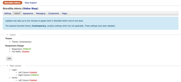
LAYOUT
ChannelOnline makes it easy to get started by providing built in customizable layouts and data driven components. Start with a main theme and alter the pages to build out branding, messaging and other customer related features.
Layout: Establish your main wireframe by selecting a layout.
- Themes. There are three main layout themes to start with in ChannelOnline.
- Classic (Default) – A legacy look and feel that was originally implemented into the system.
- Contemporary (Recommended) – Updated modern look and feel with more column options, common store components, and marketing opportunities.
- 508 / ADA – A new store theme was added for end customer accounts that require compliance for contract obligations. This theme can be used in two ways.
1) Select the store theme, “Theme: 508 Compliant”, and a color palette for a specific store site. The theme is selected on the Layout page, the available five color schemes are on the Appearance page. The ability to perform advanced changes and certain features are not available with this layout. Key compliant changes include form field highlighting, color control, font size and color, and some tab navigation. We recommend turning off any extra pages or marketing components for best adoption.
2) Use your store as is, and users that need to see it as 508 can be switched to that themed view in contact settings. Enable the new contact level setting, “Use 508 Compliant skin on the assigned storesite”, to apply it to a specific contact. This 508 theme controls aspects of the layout for compliance, such as; login page, home page, search results, product page and the cart. Some agencies and customers may have additional requirements that are beyond the current scope of this offer. Contact support if you have any questions.
Note: If interested in trying this theme, you can test this out on your Preview store. That way your live store is not affected.
- Responsive and/or Full Width. Break out of the default fixed width store format and expand it across the browser window (full width) or enable responsive to fit for use on a mobile device. This also makes the use of electronic signature more mobile friendly.
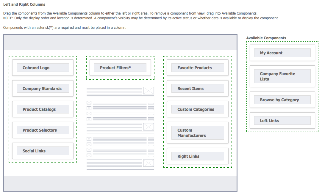
Page Layouts: Left and right column activation/deactivation is available with the Contemporary theme. Keep in mind that the main body of most pages are controlled by the system. You can add one to the right or left side, or both, depending on how you want that page type displayed. Once added, select components from the Available Components area (to right side of the layout view) and drag them into position within a column on the layout diagram. For some pages components can e added to the top or bottom of the main body section. Components can also be removed from a column by dragging it into the Available Components area. The Product Filters component can be placed in any of the three columns (these are the search result filters).
- Login. Main body elements (Greeting Message, Login fields, and Marketing Message) are set but sections above and below are open to components.
- Home Page. Mix it up on your home page where you have the most product and marketing components to use. Try moving things around by reordering the sections and columns on the home page. Maybe start with having custom HTML, spotlight items carousel or featured products at the very top.
- Catalog (browse). Page layout and components to be used when customers browse the catalog using manufacturers and categories. It is helpful to include the Product Catalogs, Categories, and Manufacturers widgets on this page.
- Search Results. Page layout and components to be used when a set of search results are returned from browse (above) or from search bar input text box. It is helpful to include the Product Filters widget, as well as Product Catalogs, Custom Categories, and Custom Manufacturers widgets on this page.
- Product Overview. Page layout and components to be used when customers are specifically looking at a single item. It is helpful to include the Product Catalogs, Custom Categories, and Custom Manufacturers widgets on this page.
- Cart. Page layout and components to be used when users are in the cart. It is helpful to include marketing Coupons, Recent Items, or custom HTML blocks or banners.
- Pages/Tabs. Page layout and components to be used when for all your custom pages; this layout will be used consistently across all these pages. Use additional components as desired.
- Activity (User/Visitor). Page layout and components to be used when user select the activity link in the top navigation. It is helpful to include Coupons and custom information.
- General. Default catchall layout for any page that is not defined above.
| Column Layout: drag and drop components into desired columns. |
 |
APPEARANCE
The appearance section is where the store styling gets set.
Look and Feel: Colors, Skin Styles (borders) and fonts. Available color schemes and font selections:
- Skin Styles. Styles help to make the line and corners of displayed containers to be either: none, shaded, 90 degree, rounded or rounded and shaded.
- Color Schemes. Each color scheme comes with predefined color sets of three or four colors which will naturally work together: Azure, Business Bold, Clean Denim, Emerald, Natural Green Magenta, Orange, Purple Amethyst, Retail Red, Sunny Gold, Teal, Advanced* (uses the advanced section, see below).
- Fonts. Fonts are available to be set to one of three sizes and in font types: Arial, Fira Sans, Georgia, Lucida, Roboto, Sans-Serif, Tahoma, Verdana, Work Sans, Zilla Slab. Look at the sample text on the right to validate what will be displayed.
Advanced: For more control over customizing colors, buttons, and text. Use with caution; settings can be returned to original defaults selected in Look and Feel. Subscribers to the Advacened CSS service will see the Custom CSS entry box at the bottom of the page for adding any Cascading Stylesheet changes.
NOTE: To see how colors are applied to the layout, download the Theme Color Guide in Advanced edit.
Samples Content: Sample content is available for most components of the StoreSite. New StoreSites will get sample content pre-populated into the selected starter template.
To activate sample content for existing StoreSites, select “Load Components and Sample Content” in StoreSite Admin > Layout section and then select
the type of content you would like to load. Loading sample content WILL OVERRIDE any existing content you have already established for your StoreSite.
Sample content is available for the following components:
- Social Links – links to FaceBook, LinkedIn, YouTube and Twitter are inserted
- Business Contact Info – we pull your company name and your customer support email address
- Business Logos – three blank placeholder images will be inserted in the footer
- Top 10 Manufacturers for Browse Menu (Right Column) – manufacturers are based on all ChannelOnline activity
- Top 10 Categories for Browse Menu (Right Column) – categories are based on all ChannelOnline activity
- Banner Carousel – three placeholder marketing banners will be inserted in the marketing carousel on the home page
- Custom HTML – sample custom HTML will be inserted (based on starter template for new stores) into the custom HTML field of the home page
- Top 20 Products for Spotlite and Featured Products (from the Systems category, across all of ChannelOnline)
- Business Logo – a placeholder logo will appear in the left side of the header
- Co-brand Logo – a placeholder logo will appear in the left margin
- Support Messages on the home page
- Custom links – three generic links will appear in the top, left, right and bottom of the store
- Default Messaging – sample text for the Welcome Message, Pricing Disclaimer, Privacy Policy, and Terms and Conditions
Revisions: Provides administrators information on when the last change was made, and a history of change dates and times. The rollback feature allows users the ability reset the store to an older date and time from the history list (last 30 changes).
Reference: Store Example Images
MESSAGING
StoreSite support messages created in Admin > StoreSite Admin > Support Messages can be made with rich text formatting, set a start and end date range, and be assigned to selected stores.
Store: Insert your store marketing messages in this section to the default messaging locations. These include a greeting message, marketing text, and new user messages. Be sure to enable the support messages for delivery from the Store Support section.
Login: Enable/disable a few login options for forgot password, remember email, or to hide login fields completely (typically used for punchout services).
Legal: Insert your store legal messages for Terms and Conditions, Privacy Policy, Price Disclaimer and Checkout Confirmation.
Logos and Branding: Add your logo image sized for the header section of the store and other minor logos and icons.
- Site logo or name in text
- Co-brand logo for dedicated end customer stores (Example: a store for a specific school district or university).
- Favicon. Add a favicon to the browser tab for customers to know that tab contains your store.
COMPONENTS
General component use information. Most components are available for display on the Home page only; others which can be used on multiple pages will be identified separately. When adding components, administrators can move them from the Available Components area (on right side of the Layout view) and drag them into position within a column on the layout diagram. Components can also be removed from a column by dragging it from a column into the Available Components area.
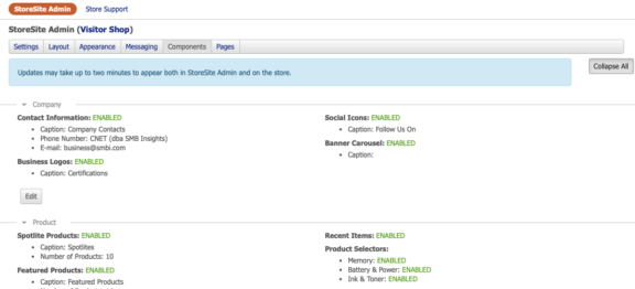
Company: These components are focused on promoting your company and brand.
- Contact. Enter your basic contact information for store footer display.
- Social Icons. Depending on layout, the social icons will appear in the left navigation pane or the footer by default (can be move by page type).
- Business Logos. Add certification logos, or business partner logos to your store. Promote your business by adding certification, award or business related logos to your Store. Examples of logos that could be uploaded include Microsoft Certified Partner, The Better Business Bureau or ASCII Group Membership.
- Banner Carousel (home page marketing). The marketing carousel appears on the home page and holds up to 8 banners that will appear on a rotations (from 1 – 20 seconds). Each banner can be flipped through at a click of a button and opened into a new window/tab. By default, the carousel will appear below the support messages and Custom HTML block. It is recommended to make sure that all your banners are the same pixel size, the system will not size them for you.
Product: These components are focused on promoting goods and services on various store pages. Most focus on the Home page but some can be placed on other pages, typically one time per page. NOTE: For best results; download and resize all images prior to adding them to the File Cabinet > Image Drawer or directly to the component.
- Spotlight Carousel. The Spotlight Carousel appears on the home page and enables you to upload up to 20 banner images that can be flipped through at a click of a button. By default, it will appear below the Custom HTML block and the Marketing Carousel.
- More details can be displayed to the visitor when switched to grid view. When a user hovers over an item in Spotlights, if the view is set to grid, they we be shown a tip window with more product information. It expands to show more details like manufacturer number and the second line of description (helps for better selection accuracy).
- Featured Products grid layout. You can now choose to have up to 20 featured products display in a grid layout or line-by-line. Featured Products appear by default below all other home page components.
- More details grid view layout display. When a user hovers over an item in featured products, if the view is set to grid, they we be shown a tip window with more product information. It expands to show more details like manufacturer number and the second line of description (helps for better selection accuracy).
- Category Banner (carousel). Focuses on highlighting key categories or sub-categories that you sell. You can add up to 20 categories with links and images to the banner carousel.
- Select a category from the list of available categories in that store’s default catalog. Rename title for banner, if desired.
- Select to use a system loaded category image or add a custom image of your own.
- Select to assign a link to the category image; choose either our system generated search link or your own custom search destination.
- Brand Banner (carousel). Focuses on highlighting key vendor partners or product lines that you sell. You can add up to 20 manufacturers (brands) with images and go to links to the banner carousel.
- Select a manufacturer from the list of available manufacturers in that store’s default catalog. Rename title for banner, if desired.
- Select to use a system category image, or add a custom brand image (logo) of your own choosing.
- Select to assign a link to the brand image; choose either our system generated search link or your own custom search destination.
- Recent Items. Enabling recent items component allow the administer to place this component on search, product pages and cart.
- Product Selectors. Product Selectors for Ink & Toner, Batteries & Power, and Memory have been introduced into ChannelOnline
as a free feature. 1WorldSyncContent Solutions reserves the right to solicit and promote vendor sponsors for the Product Selectors. You many choose
to activate or deactivate the Selectors at any time. - Site Settings. Site settings will display the catalog that is assigned to the store in the footer.
Navigation: These visitor additions will assist in customizing the store experience.
- Assistance Links (for visitors). These links will control what navigation options all visitors that log in to the store will see: My Account, My Favorites, Reports (activity), Ask Sales (form), Account Activity (documents), Legend, and Logout option (sometimes disabled for punchouts).
- Custom Links (top, left, right and bottom) – Administrators can also create custom links to be placed around the store layout. These links can use database merge fields (like global custom fields and email templates) to send data to 3rd part systems.
- Footer links (system). Pricing Disclaimer, Privacy Policy, with Terms and Conditions, will appear as footer links.
- Browse Manufacturer Menu. Custom manufacturer menu used to highlight primary manufacturers that your business supports.
- Browse By Category Menu. This menu is based on the catalog assigned to the store or logged in visitor.
- Browse Category Menu. Custom category menu used to highlight primary manufacturers that your business supports. This navigation solution allow admins to ‘group’ categories together under ‘labels’ that they create for a more custom navigation experience. This is different than the category list built off the available catalog. The system allows 2nd tier categories to be added to these groups (in the three tier mode). As they are added they will be removed from the available categories list.
- Other Navigation Components:
- Search – Search is a movable component that can be placed in side columns, plus above or below the page body. Classic layout users can move the search bar from header to be placed above the body on all pages.
- Product Filters – The Product Filters component (search result filters) can be placed in any of the three columns available on the results page.
- Company Favorites – Also no longer static, this block can be moved into side columns, plus above or below the page body.
Custom HTML: Create custom HTML blocks or use it for image Ad messaging on any page in your store. Once enabled, they will appear in the Available Components column in page layouts. Build them by going to Components section of Store Admin.
Custom (Banner) Carousel: Create custom banners that can be placed on other pages of the store (not just the home page). Like the home page carousel, use it for image Ad messaging on any page in your store and make it available pre or post login. All banners have a setting for rotation speed that can be set from 1 to 20 seconds. Once enabled, they will appear in the Available Components column in page layouts.
Marketing: Marketing is not controlled in Store Admin but coupons created and enabled in the Admin > Marketing section will be available as a component for your store. For more about using coupons, see Promotional Coupons.
-
Coupons. Once enabled, they will appear in the Available Components column in page layouts. After you place it on the store and a user clicks on it, a lightbox will appear with all the promotional details (see image).
-
Other coupon settings include: Usage limits for coupon codes for the total number available and number per account. Setting minimum order value option for limiting when a code can be used. Limit one per customer checkbox.
- All coupon code activity will be captured and added to the document activity log.
-
PAGES
If you need additional tabs for your website for additional information about your business or services, try using Pages. Plus, along with the custom HTML editor, users can iframe an external page or video player into the hosted ChannelOnline page. To insert a video link you must go into the “Source” view on the HTML editor (not the text editor view, see image).
- Tabs and Pages. Custom pages designated as Tabs will appear on the search bar at the top of the store. Other custom pages can be used as landing pages or linked to via the store links components. Tab/pages URL names (url and title tag) can be customization by renaming Custom Tabs/Pages autogenerated name in the url to a word specified by the admin user. This can be done on the sub-tab, page edit.
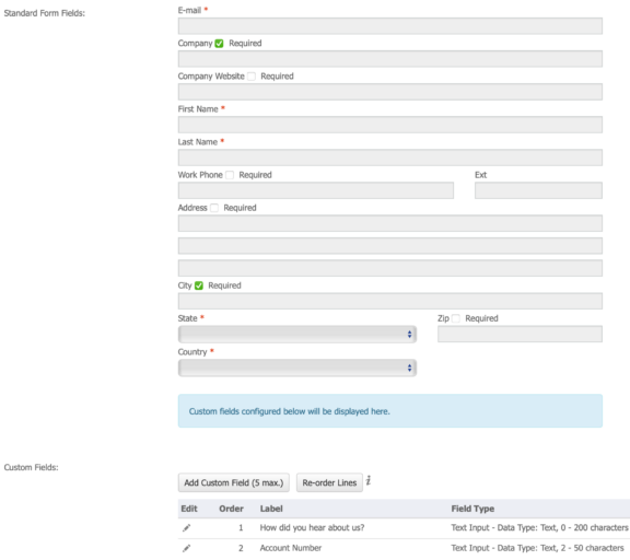
- Contact Us. Allow administrators to enable the Contact Us page, set its location, provide messaging around the contact us form, along with a successful submit message. Custom fields can also be added to the form to capture additional information.
- Registration. Similar to contact us, the registration or has some required fields and the ability to add custom fields for additional data capture. This will be available when self registration is enabled in Admin > StoreSite Admin > Settings general section.
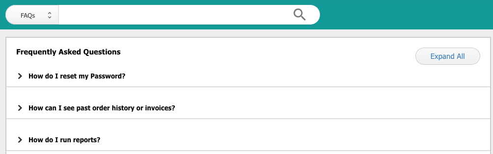
- Frequently Asked Questions. Allow administrators to enable the FAQs, set its location, and provide introduction messaging for displaying FAQs on the store. FAQs are managed out of Store Support (see below).
Create/Edit Pages (example)

Registration Edit (example)
END CONTACT (Visitor) OPTIONS
These options and actions are available to registered logged in visitor contacts.
- Registered (logged in) User Defaults:
- Set Favorites Lists – Visitors can select and set default favorites lists (helpful with account dedicated stores). Note: Company Favorites are integrated pages into the store for best visibility.
- Search Results – Visitors can select the number of results they want to see per search results page from either 20, 35, or 50.
- Language Preferences – Registered users their default language for once they have logged into the store: English (default), Spanish (US), or French (CA). To set that preference users must login, click Account, and edit their contact information.
- Change Password – The change password function requires a user’s current password for setting up a new password.
- Compare Items. Users on the store will see either selected items at the top of the search results (classic) or bottom of the page (Contemporary). From there, users may compare up to 10 results, add to the cart, or to favorites. In classic theme, these changes are found in the Line Action dropdown selections.
- Document Custom Note. Account specific messages can be added to your accounts from the account settings edit page and be viewable by that Account’s contacts on the cart. This allows you to provide unique account buyer information where they need it.
- Catalog Control. Ability to prevent products that are not in a customer’s active catalog from being added to the cart. This functionality prevents items from favorites, spotlights, or featured products to be addd if not in the current catalog. Enable by selecting the checkbox in your selected store’s Settings > Cart section next to “Allow Only Items in Current Catalog to be added to cart. Prevents items from …”.
STORE SUPPORT
An important part of any e-commerce store is customer awareness and messaging. The Support section allows administrators the ability to create login, post login, and sepecial page messages.
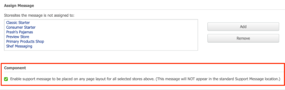
Support Messages: Post a support message on the login page instead of just home page with the ability to display in a lightning box just like the “before you get started banner”. Store support messages are managed by going to Storesite Admin > Store Support and navigating to its own sub-tab.
-
Managing. First, create a new message or edit an existing one. In edit do the following three steps: 1) assign to a storesite, 2) select the Component option, 3) then check the checkbox in the Lightbox section. By checking component checkbox it allows you to place it on any of the store’s page layouts.
-
On store. When enabled, a lightbox window will open when a users land on the designated page. If multiple messages are placed on the page, the messages will stack in the one window.
-
Login Support. Post a message on the login page to be viewed before users login, or on any other page type you’d like. This is useful communication tool for private stores or to place a special tip on the search page. Be sure to check the Component enable box for diverse placement within your store.
- New User Message. This welcome message, when enabled, will appear the first time a user visits the store. To create a New User Message lightbox, open the Marketing section, click Edit, and scroll down to the Enable Lightbox section above the New User Message Title field (note: this is different than the standard welcome message). This editable welcome message comes preloaded with three tips on using the storesite.
Store FAQs:
Store Admin > Store Support includes a preloaded FAQ section that can be activated on a per store basis. You may edit these sections, add your own to it, or create a whole new set of selections to suit your business needs. FAQs are managed in two places. First, go to the Store Support section in StoreSite Admin and then select the “Store FAQs” sub-tab. On the Store FAQs page, you can manage multiple FAQ lists made up of questions and responses that, once enabled, can be added to Stores. When you are in a specific store’s edit pages, go to the Pages sub-tab and open the FAQ section to enable the FAQ list that is appropriate for that store. All FAQs have the following characteristics:
- Editable HTML introduction text spot
- Preloaded FAQs (editable)
- Create / edit new one up to 25 entries
- Reorder topics (lines)
- Accordion style display page, needs to expand on topic select
- FAQs are searchable on the storesite
Support Visitor Access:
- Support Access feature. There is an employee access right to allow sales support reps to Login as a Contact to the store. Users with this right will be able to access the store as the contact but will not be able to place an order. To add this to your Access Right Profile, admin users can go to Admin > Personnel > Access Rights > and enable “Login to store for Contacts a user has access to“ in the accounts section (See access rights).
E-MAIL NOTIFICATIONS
E-mail notifications have been added to the system to inform customers and sales representatives about activity on the store. Email templates and be enabled and modified in Conttol Panel > System E-mails > StoreSite sub-tab.
The following are available:
- Forgot Password. Sends an email to a customer when they click the ‘Forgot Password’ link on their assigned StoreSite.
- Change Password – Contact change password notifications. System will send a notification email when users change their passwords. Activate and edit the Password Update Notification in the System Emails > User Accounts section to begin using this feature.
- Contact Registration (customer / sales). Self-Registration Notifications can be sent to sales and customers when a visitor has self-registered on a StoreSite.
- Ask Sales. Sends an email to sales when a customer clicks the ‘Ask Sales’ link in their StoreSite and can include shopping cart details (see Components, Navigation section).
- Saved Cart Notification. Sends an email notification to the assigned sales rep when a customer has Saved a Cart for later on the StoreSite.
- Abandoned Cart Notification. Sends an email to the assigned sales rep when a customer has placed items in a cart that was not converted to a sales order, cart was abandoned, or the session expired prior to checkout.
- Contact Us (customer / sales). Sales reps can receive an email from the storesite contact form. And/or visitors can receive a confirmation email fafter submitting the contact form.
CPAS (Company Purchase Approval System)
Company Purchase Approval System (CPAS) is a premium service which allows either the reseller or end customer to set up an approval hierarchy for an account. Enabling this service makes it so that some employees at the end customer will need to have their orders approved by one or more other employees at their company. Notes about CPAS visitors:
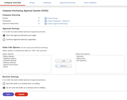
- Administrators receive a special store link that provides them access to the CPAS setup. They can:
- General approval guidelines.
- Add/remove employees for submitting orders and approvers.
- Add/remove groups for organizing departments or locations.
- Add/remove approval hierarchies with maximum currency threshold and who they have authority to approve.
- Can modify emails templates to make them company specific with messaging.
- Approvers can:
- Review and approve pending orders that meet a monetary threshold amount.
- Add required PO number when approving the order.
- On checkout, the contact will still be switched to the approver.
- Receive system generated or manually sent notification emails.
- Have 7 additional days to process submitted orders if document expiration dates are used.
- Notifications:
- Expired quote message/notification on the page for end users: “This order has expired, please copy to a new cart and resubmit to place your order.”
PUNCHOUT USAGE
Punchout can be made up of a handful of transactions, from the basic item round trip, to purchase order (PO) submit, ship status and invoice return. Settings that can be useful for stores supporting punchout connections include:
- Disable Login user name and password fields from the login page (to be used with punch-outs and single sign-on).
- Capture when required, punchout user information: first name, last name, and email.
- Notification messages and emails are being sent when an end-customer completes a punchout session on your StoreSite (emails can be deactivated).
- Notes:
- Punchout should not create abandoned carts if they complete the round trip.
- Can support for level 2 punchout which bypasses search and directs the user to the item when coming from their ERP system.
- Ability to have PunchOut Order Message exclude items within bundles, and have only bundle headers set in the punchout setup.
- No top navigation checkout button to avoid possible confusion with available actions. Users can return to their ERP system (checkout) only when they go to the cart.
- Electronic waste or recycling fees (AKA Ewaste fees) are now available in cXML punchout transmissions and the line level.
Line item notes are now available on cXML Punchout transmissions and the line level.
For more information about punchout services contact your sales representative or support.
REPORTING
Store reporting is based on account, user and order activity. Go to Control Panel > Reports > StoreSite to run account / contact reports, and to Reports > Sales for document related reporting. Use sub-total selections for improved report sorting. Store data is kept indefinitely, but stores need to be enabled for reports.
- Activity. Data around how often and which customer accounts are using the store.
- Active / Inactive Status column option to the contacts reporting.
- Contacts. Drill down into companies and contacts. Available column fields: e-mail, contact status (active/inative), last log in, and total page views.
- Forms (registration). This section allows for the retrieval of data captured on storesite registration forms; including which store, when it was submitted, and any custom fields.
- Saved Reports. Includes the ability to save Activity reports. Helps to run regular reports or add to the dashboard. Note: only summary view reports can be added to the dashboard.
- Sales Reports. To quickly see which orders came through the storesite, use the“StoreSite” filter within regular sales reports in the document status selection list.
